The Odea project was an exciting journey where I contributed as a Product Designer, Animator, and Interaction Designer, blending creativity with user-centered design principles. From the outset, we aimed to develop a super-app that would redefine the financial experience for Odeabank’s clients, combining investment, banking, and educational resources in a single platform. In my role, I focused on creating a cohesive and intuitive user experience by crafting a unified information architecture and implementing seamless navigation flows that put users’ needs first.
As an animator and interaction designer, I worked to bring the app’s visual identity to life, adding motion that enhanced usability and reinforced brand consistency. My role involved creating smooth transitions, micro-interactions, and animations that made navigation more intuitive and engaging. This attention to detail in the app’s interactive elements not only enriched the user experience but also helped establish Odea as a visually sophisticated platform in the Turkish market.
These design efforts were validated by industry recognition, with Odea winning three prestigious awards: the Red Dot, IF, and A'Design awards. This success reflects our dedication to user-centric innovation, setting a new standard in financial applications. The project underscored the importance of merging functionality and aesthetics, reinforcing my belief in the impact of thoughtfully designed interactions and visual storytelling.
Key Takeaways
Final Design


To design a user-centered super-app for Odeabank, we conducted comprehensive UX immersions, gaining deep insights into user needs, stakeholder perspectives, and industry standards.
Gathering insights through sessions with employees from various departments, board members, and third-party vendors. This cross-functional approach enabled the ideation and validation of the app’s core concept, aligning diverse viewpoints to establish a unified vision.
Evaluating the app on key UX criterias by analyzing the existing Odeabank mobile app and integrated platforms: Flows & Feedback, Guidance, Navigation, Error Handling, and UI Consistency.
Conducting global and local benchmarking of leading financial services to inform our design with best practices and industry trends.
Bringing together stakeholders from various departments on high-engagement workshops, allowing for productive ideation and alignment on the product vision and open topics, ensuring that all perspectives contributed to shaping the app's direction.
Developing personas and strategies based on survey and interview data, iteratively testing prototypes to refine the design.
Through 6 usability tests, 2 research sessions, 1 A/B test, 1 survey, and interviews with 50 customers, the 276 identified issues, prioritizing 38 of high and medium importance to enhance the user experience is addressed.
Discover & Understand
phase 2
Implement a consistent design language and behavioral patterns across all services, ensuring users experience a cohesive journey within the app.
Seamless channel integration

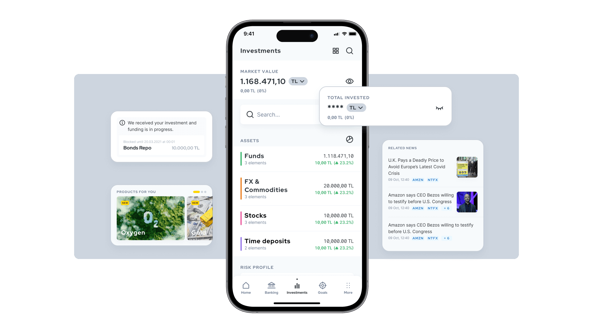
Offer a holistic view of all financial products and balances, making it easy for users to access and manage their complete financial portfolio in one place.
Centralized financial overview

Provide educational content, tutorials, and expert insights tailored to all users, from beginners to experts, to empower and support financial learning.
Accessible financial education

Deliver a high-quality, personalized experience that matches the in-branch service through curated visuals, tailored content, and user-centered design.
Enhanced digital experience quality

To address these issues, the app will unify navigation and design for a seamless experience, consolidate all financial insights in one view, provide accessible educational content for all users, and deliver a digital experience that mirrors the personalized, high-quality service found in branches.
How to solve
Users experience inconsistencies in navigation, design, and interactions when switching between different functions or services within the app, leading to a disjointed and confusing user journey.
Fragmented user experience across channels
Users need to navigate multiple apps to manage their financial needs, resulting in scattered information and difficulty in accessing a complete view of their financial portfolio in one place.
Lack of centralized financial overview
Users, especially those new to financial topics, face challenges understanding complex financial concepts due to a lack of accessible and supportive educational content within the app.
Limited financial knowledge resources
Users miss the personalized, high-quality experience they receive in branches when using the app, impacting the perceived reliability and exclusivity of the brand’s digital presence.
Inconsistent quality between digital and in-branch experiences
Users face challenges with a fragmented app experience, lack of centralized financial insights, limited access to financial education, and a digital experience that falls short of the high-quality, personalized service they receive in branches.
Problem Definition
phase 1
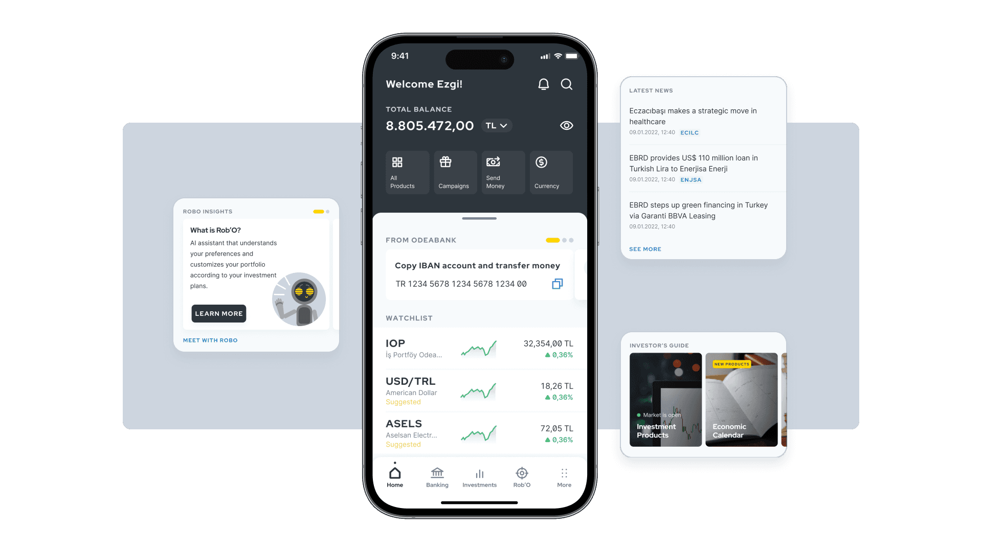
The dynamic homepage with the best content, already digested for user, that makes them feel in control
The homepage is the entry point of the experience, aggregating all the most urgent actions and every insight regarding the financial situation of the user. It works as a feed of dynamic modules that are updated with the most important content.

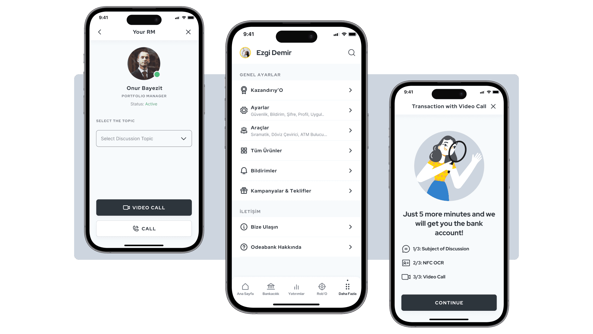
The banking page allowing user to easily perform the most frequent tasks, and manage daily banking actions such as accounts, payments, and loans
The user has access to all the daily banking functionalities and products, but is also able to customize the page to display the most important actions on top of it.
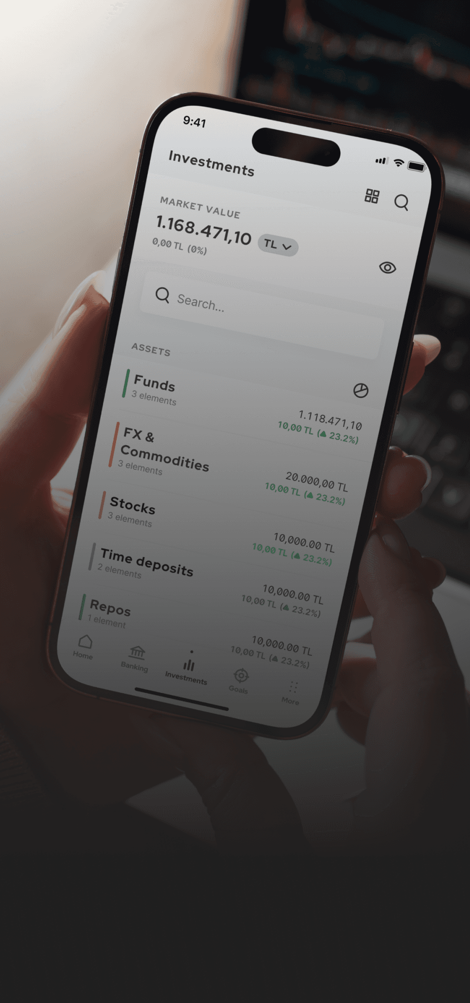
The investment page with an holistic approach with tools to customize and monitor investments
The user can see the recent activities on their portfolios, easily deep dive on details but keeping an overview of the overall financial situation. The dynamic modules are showing the most frequent actions, and the page is populated accordingly to the risk profile and products of the user.
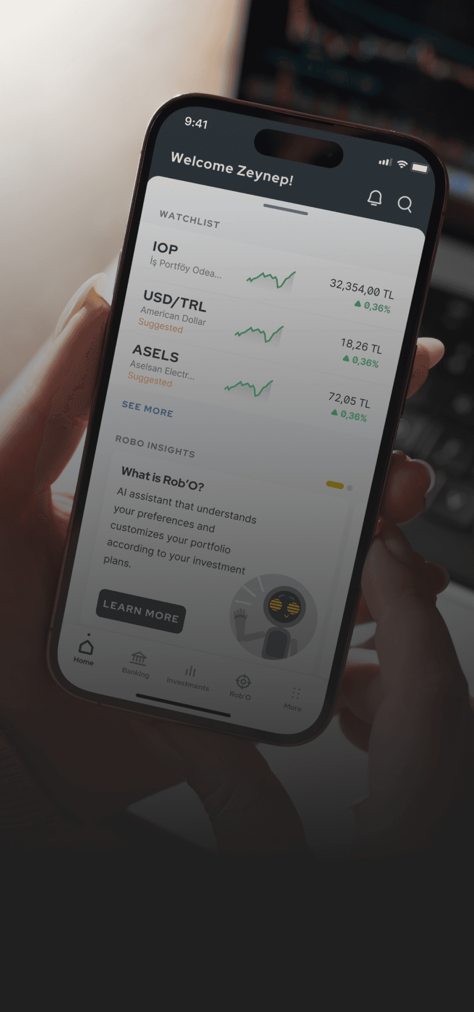
A little sneak peek…
Sr. Product
Designer
2023
2 years
Odeabank
Design Studio
Client
Timeline
Role
Year
Project
Details
Odea offers a bespoke approach toward product innovation that drives business growth and increases the adoption of the digital channel. Having a premium digital experience will help find new customers while improving the current digital penetration.
It is created as the first holistic investment solution in the Turkish market that pushes the user experience to global market standards while promoting user-centric methods and user experience.
Project
Proposition
Odea is a super-app that will work as a comprehensive financial tool for Odeabank’s clients. Odea is the first holistic investment solution in the Turkish market that pushes the user experience to global standards.
Through Odea, we're taking a tailored approach toward product innovation that drives business growth and increase the adoption of the digital channel. Our focus is to promote and represent user-centric methods and user experience on a more global level.
Overview
IF Design Award
User Interface
Interfaces for Digital Media
Red Dot Design Award
Interface and User
Experience Design
A'Design Award
Mobile Technologies, Applications,
and Software Design

A super-app designed to be the first holistic investment solution in Turkey, bringing global standards of user experience to Odeabank’s clients and driving digital adoption through innovative, user-centric financial tools.